A new year is upon us. It’s everyone’s favorite time to set goals and look ahead at what’s to come. In the online world, a lot can change in twelve months. Especially when it comes to technological advancements, best practices
Your website is a reflection of your business, and staying current with web design trends can have a big impact on your website’s success. People want to visit a site that feels up to date, engaging, even exciting.
Whether you’re finally making your site responsive, adding augmented reality, or making your site more “social”, smart businesses in Charlotte and beyond are updating their websites to make the best impression on potential customers.
Here are the top web design trends we’re watching in 2019:
Microinteractions
The use of microinteractions (or micro-animations) is one of the biggest website design trends right now. Tiny on-screen movements triggered by a single action on a site or app are meant to make the user experience more interesting and engaging.
A check mark appears when your photo finishes uploading. An image moves slightly when hovered over. Hearts float across the screen once you click a “like” button. These are all examples of microinteractions. These subtle reactions provide feedback to the user and make your site feel more “human”. And there’s no doubt, people love them.
Video Backgrounds
For years, video has been growing in importance for online marketing strategy. Video keeps users on a site longer and communicates more, faster. Recently, we’re seeing more and more sites using video headers or full-page video backgrounds on their homepage. Facebook has even introduced video as an option for the header area of business pages.
Video backgrounds work best with a dark video behind light text. Or, make the video the focus entirely and keep text separate.
More (and More Advanced) Chatbots
Chatbots can save a huge amount of time and labor for businesses. They also help users avoid wading through content to find the information they need. Thanks to advancements in AI and machine learning, chatbots are becoming more intelligent and efficient. So, in 2019 we expect to see them used even more in web design and user experience.

Like other aspects of web design, chatbots will continue to become more engaging, personalized and inviting. They might even crack a few jokes. We expect to see bright colors, first names and more predictive problem solving continue to emerge.
Minimal and Monochromatic Designs
This classic design trend is not going anywhere. With so much information hitting us on a daily basis, white space is ever more important. Black and white or monochromatic themes cut through the noise and put the emphasis on your product, brand or message.
Especially with the rise of animations and fade-in effects, website designers have the freedom to start minimal and add in information only as necessary.
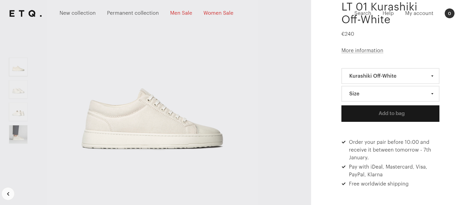
ETQ’s chic whitewashed site shows us that in the age of limitless information, sometimes less is more.
Edgy or Nontraditional Design
It’s time for web design to start breaking the mold. Nontraditional layouts began popping up more in 2018, and we think this trend will keep gaining steam in 2019. Asymmetrical or broken grid designs place elements in unexpected locations, breaking away from the grid format we’ve known for decades. You could also see more overlapping elements and creative scrolling, like horizontal or even diagonal and parallax, which keeps some elements “sticky” while other move.

This example from Madewell’s homepage uses overlapping elements that push the boundaries of the grid layout.
More Curves
As the world becomes ever more screen-oriented, web developers are finding ways to add curves and fluidity to web designs. Squares and straight lines are giving way to more organic and natural-looking shapes. This could mean anything from rounded curves on design elements to circular profile pictures to amorphous blobs surrounding text.
With the new curve revolution comes the newest wave of rule-breaking onscreen: serifs. For decades, we’ve been told serifs are for print and sans serifs are for the web. The clean readability of sans is still your best bet for longer bits of text – but serifs are now making their way into headlines and callouts. After all, they’re decorative and thus, perfect for grabbing attention.
Icons
Icons help make navigation menus or gridded elements more eye-catching and communicative. Form a functional perspective, they are scalable without sacrificing quality and, since they’re small, they won’t slow your website’s loading time. You can even apply micro-interactions to icons to add interest.
Bold Typography
We predict more and more designers experimenting with typography in website designs for 2019. From huge, bold headlines replacing images in the header area, to animated or broken typography that actually becomes part of the image, designers are pushing more and more boundaries with typography in an effort to capture the attention of busy web users.

Watch in 2019 as web header becomes billboard.
Single Page Design
Site speed continues to be an important factor in SEO and overall user experience when it comes to website development in 2019. Single page design, also called pageless design, is just what it sounds like – instead of multiple service pages and blogs organized in a hierarchy, everything lives on one page. You can still have a navigation menu for ease of organization, but single page sites use scrolling to bring you down the page to where your desired information lives.
Single page websites look great on any browser or device, and play extremely well with our new mobile-first world. They are uncluttered, clean, modern, and non-distracting. Not to mention, they tend to have great conversion rates.
The Hamburger Menu
We’re not talking about food. You’ve seen the hamburger menu before – it’s those three little horizontal lines that when you click, opens up a menu of options. This menu style keeps sites clean and

Bojangles uses a variation of the hamburger menu with their connect-the-dots grid at the top right corner. Click it and voila! An expanded menu appears.
We’d love to hear from you – what web design elements will you be experimenting with in 2019?